Freeze Jiating Shi | MFA2

about

੯‧̀͡⬮੯‧̀͡⬮ Graphic Designer. werwerwer Bilingual Typography. Publication. Editorial Design. Creative Coding. werwerwerwer LA-Shanghai werwerwerwer੯‧̀͡⬮੯‧̀͡⬮

  • Mouse or trackpad or stylus?

    Trackpad master here werwerwer

  • How are you doing?

    ੯‧̀͡⬮੯‧̀͡⬮੯‧̀͡⬮੯‧̀͡⬮੯‧̀͡⬮

  • What are you listening right now?

    Holiday

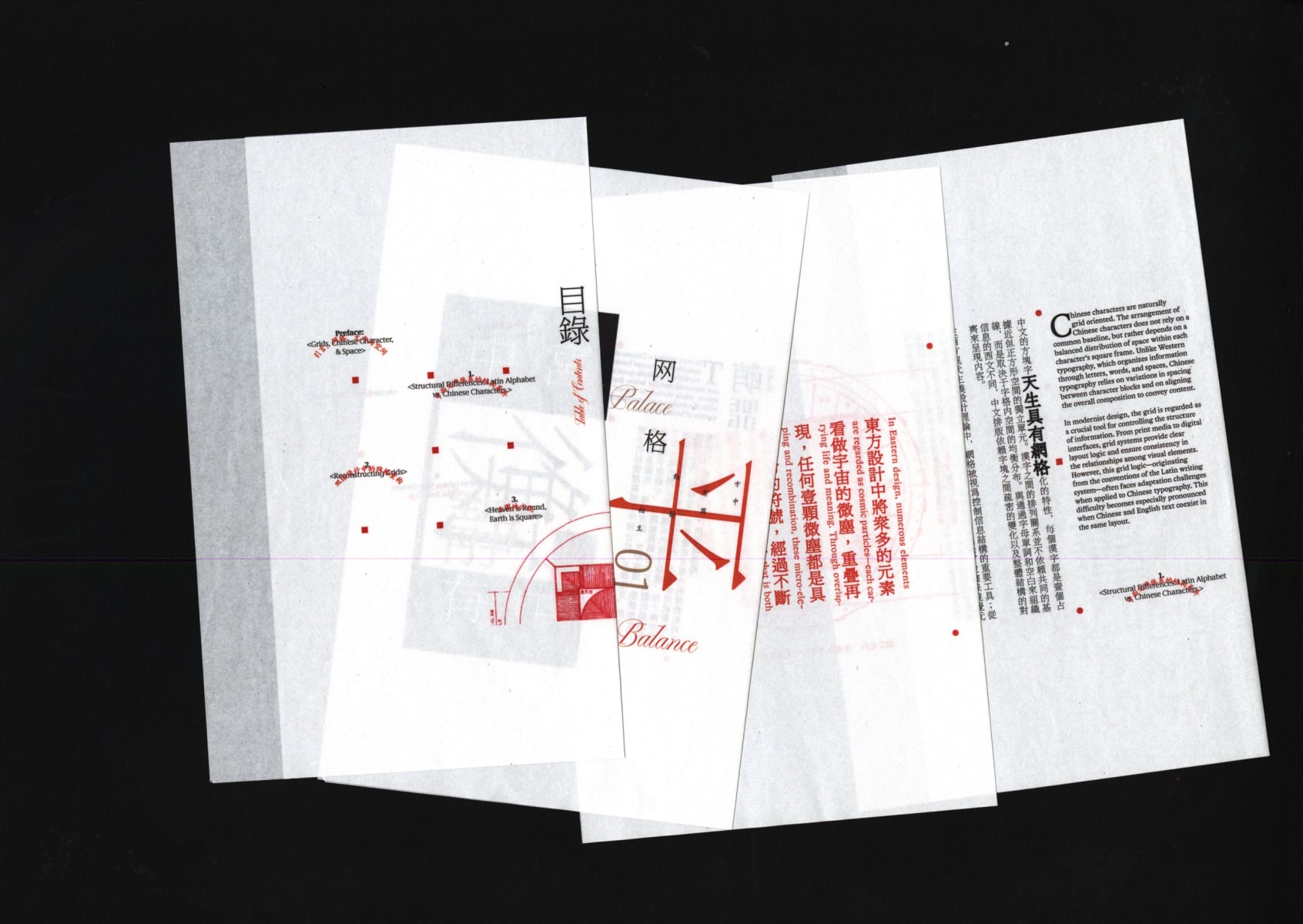
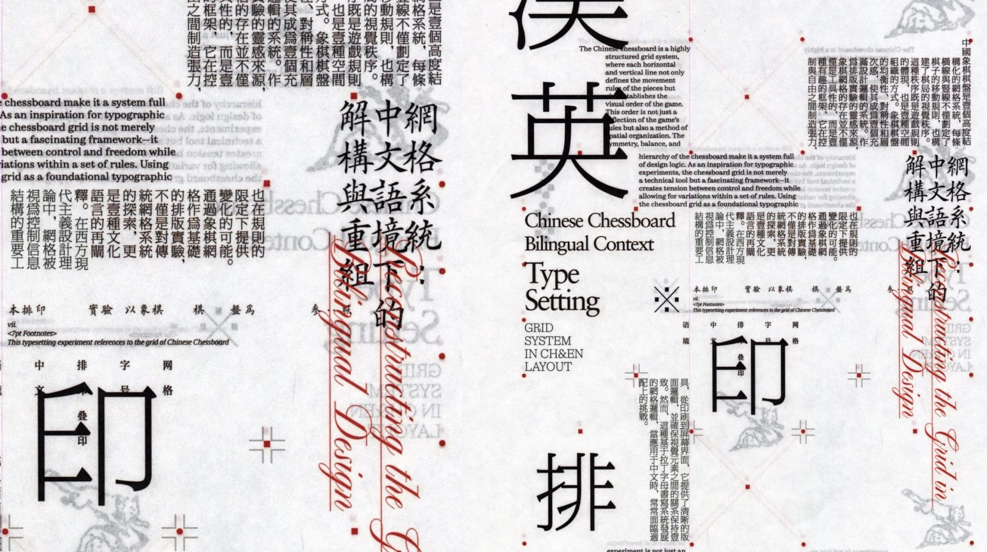
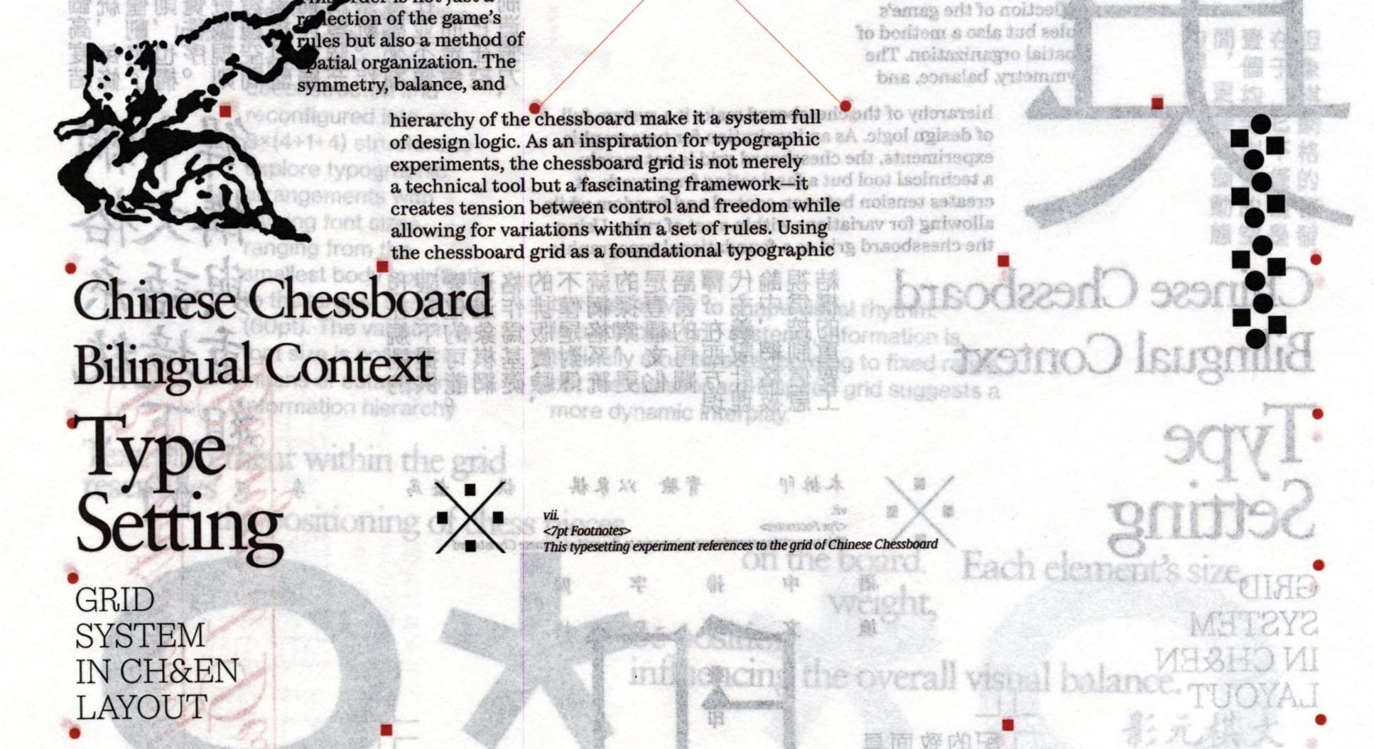
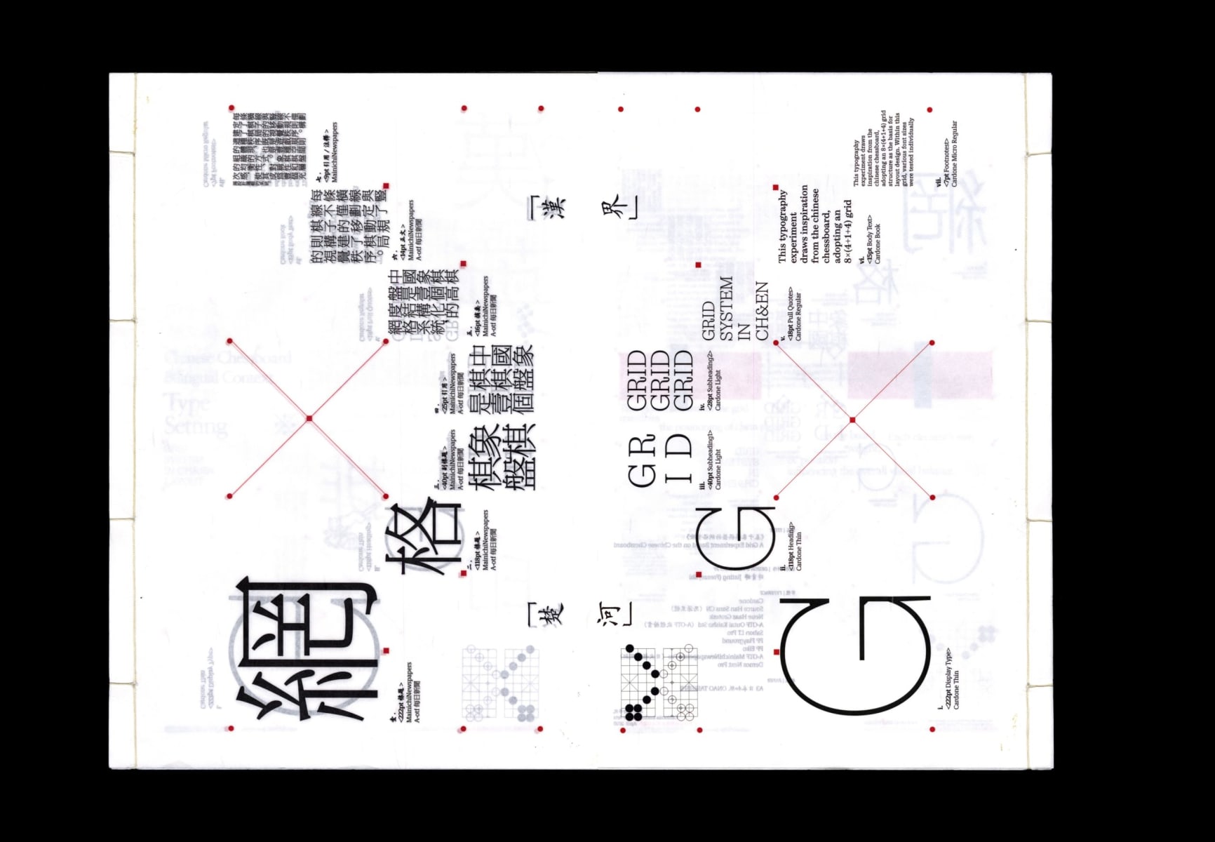
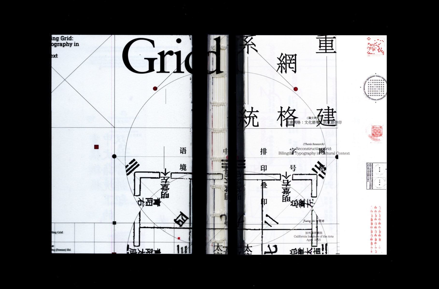
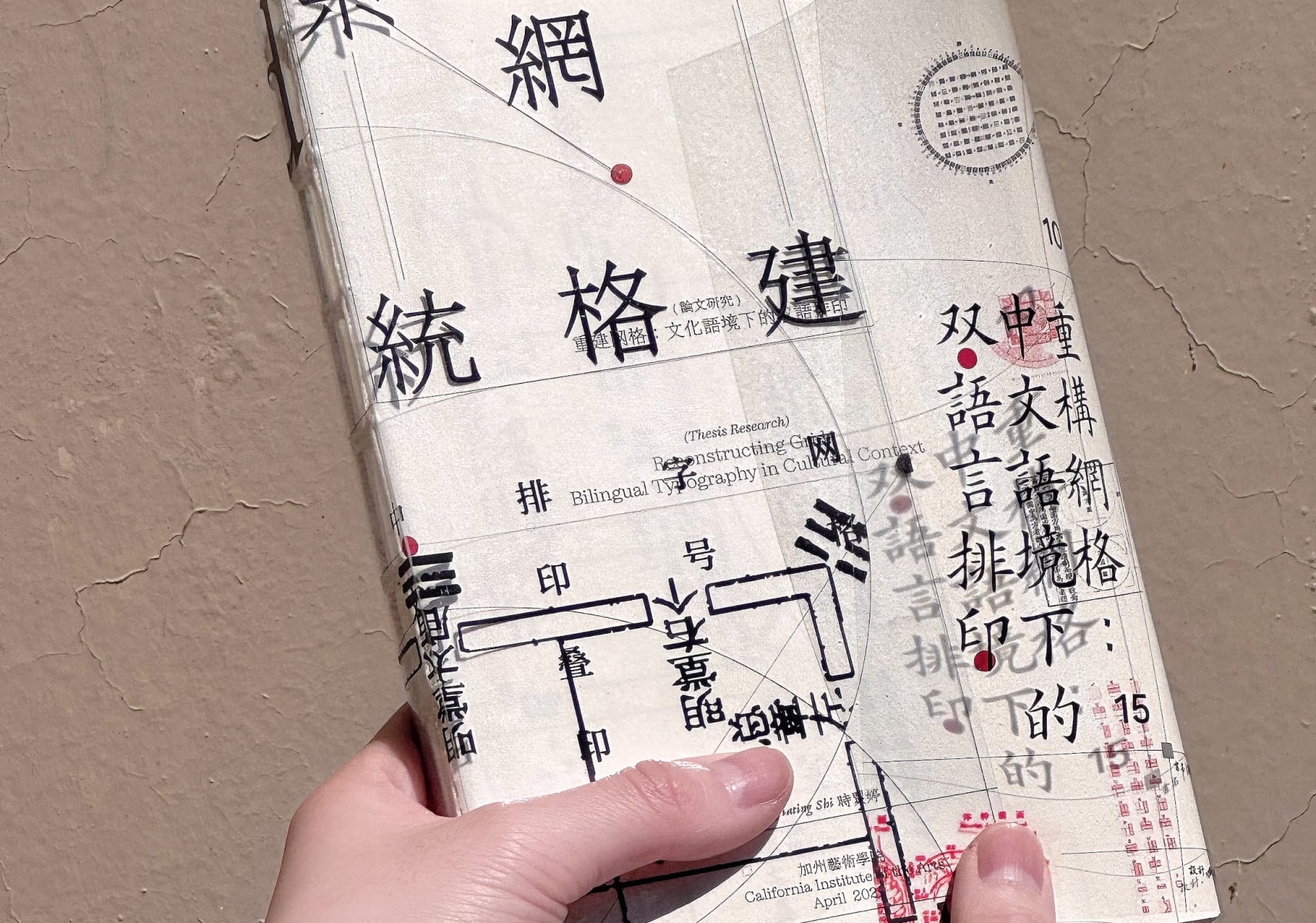
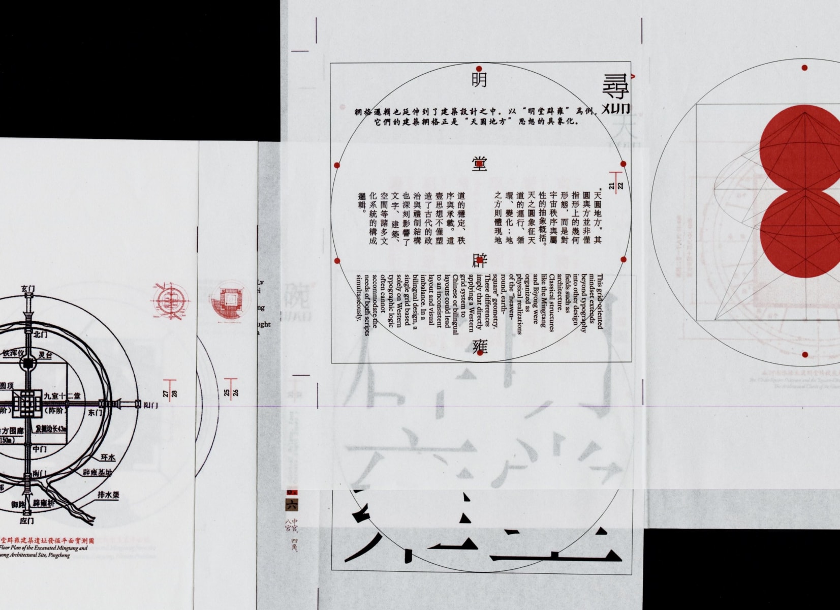
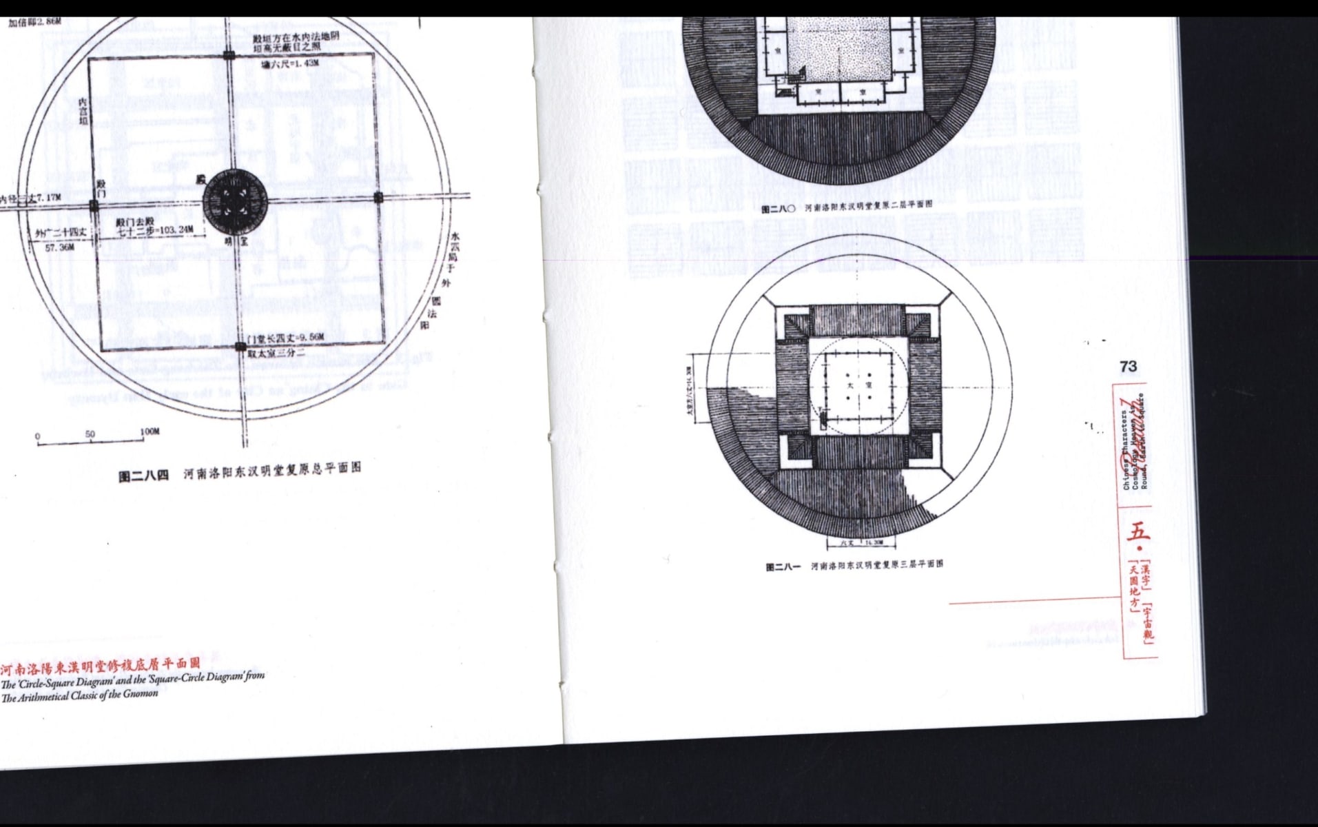
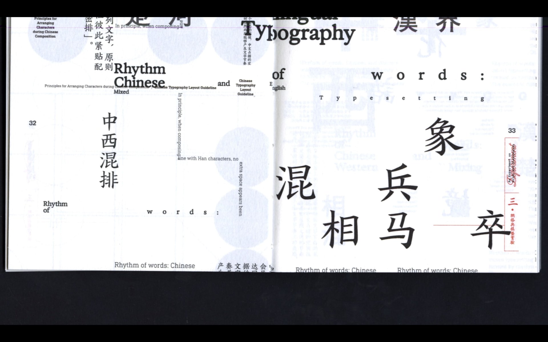
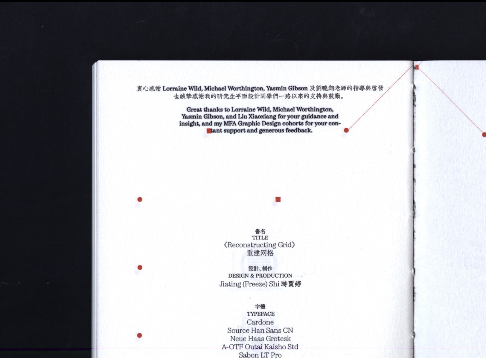
Reconstructing Grid: Chinese Typography in Bilingual Design context

  • #Publication
  • #Print
  • #Typeface

This project aims to establish a culturally resonant and flexible typographic grid system rooted in the structural logic of Chinese characters. It develops a methodology and design philosophy for moving Chinese typography beyond the constraints of Western grid systems, providing a framework that aligns with its cultural heritage while offering practical strategies for bilingual design.
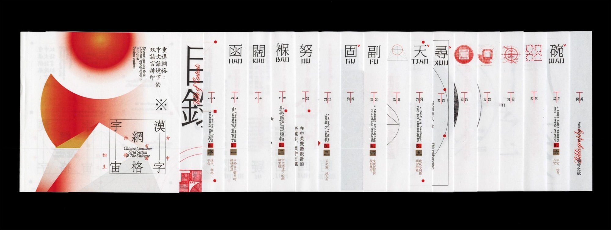
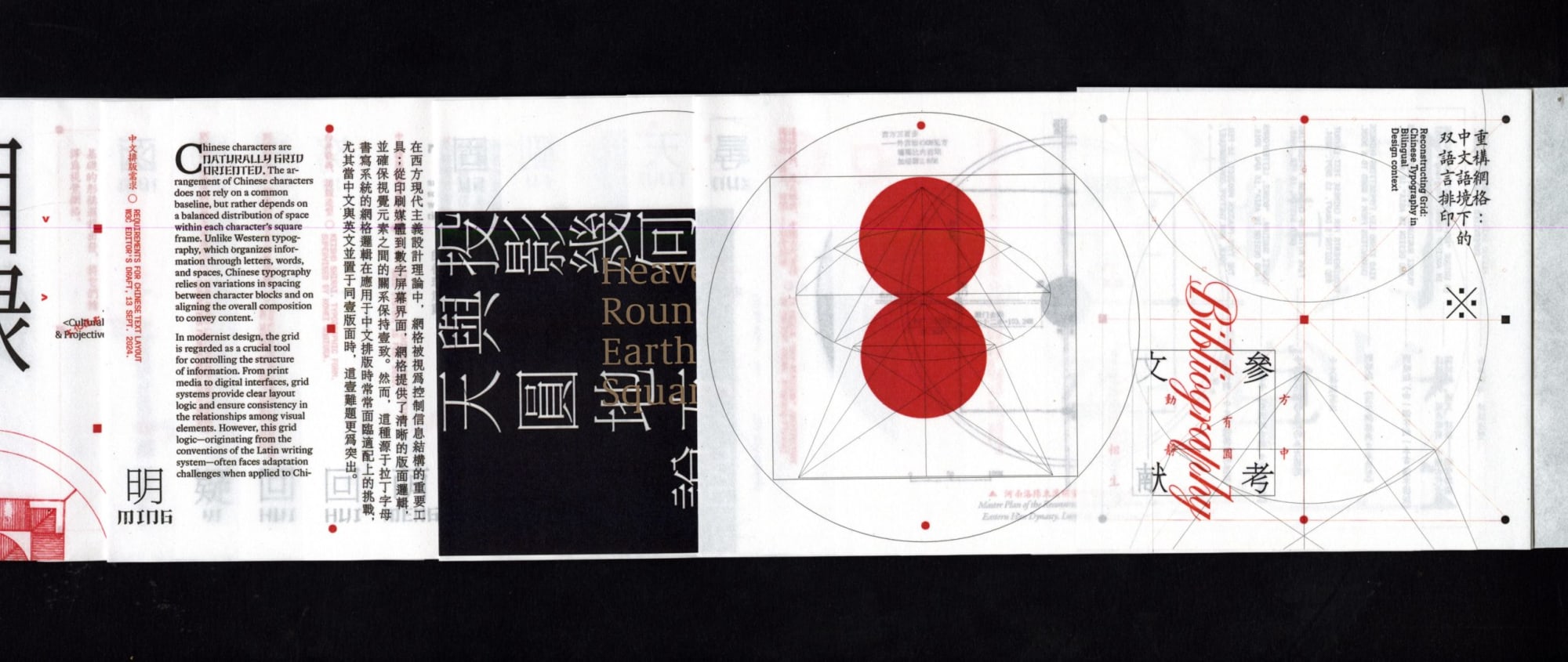
Reconstructing Grid: Chinese Typography in Bilingual Design context

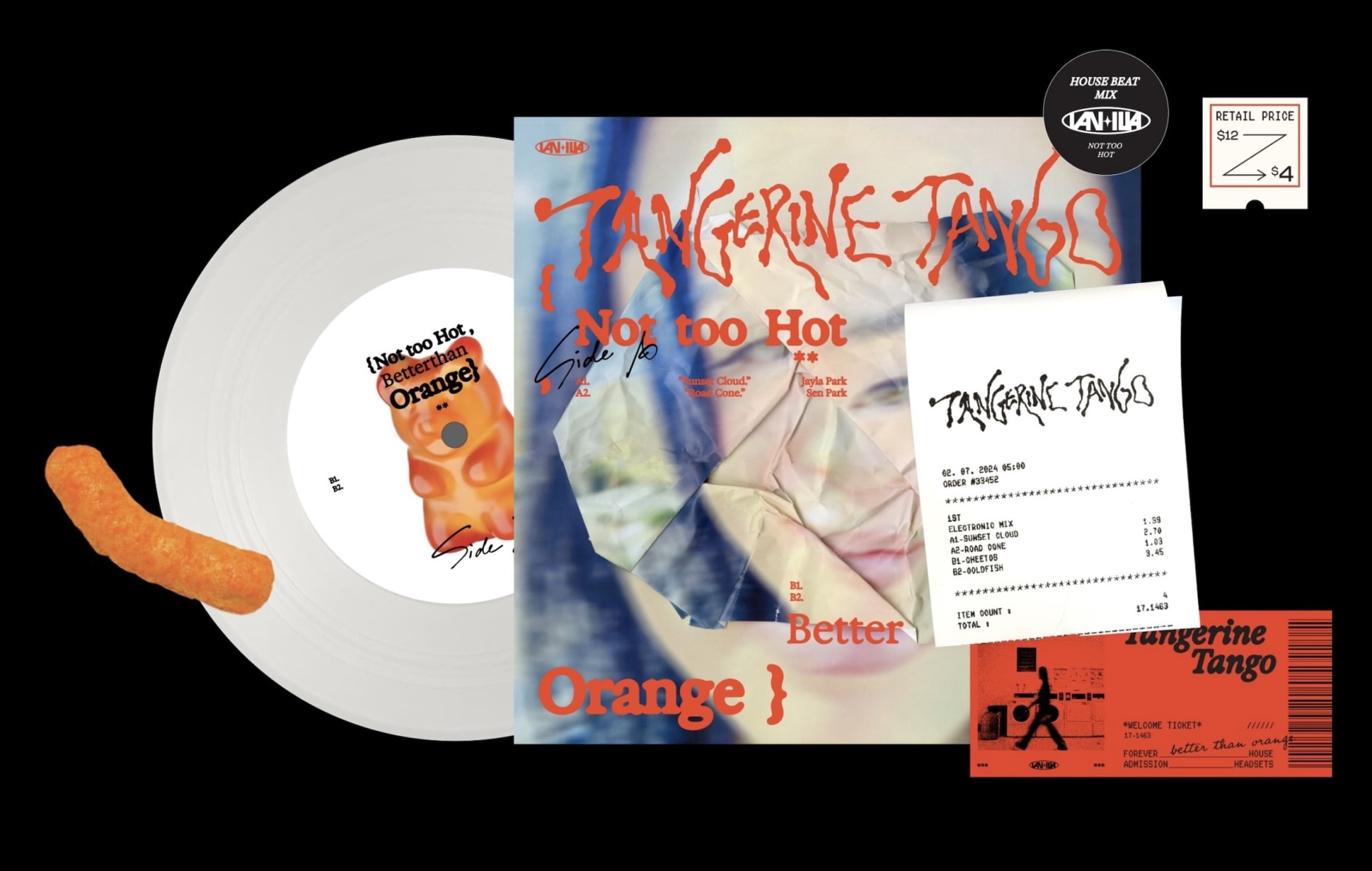
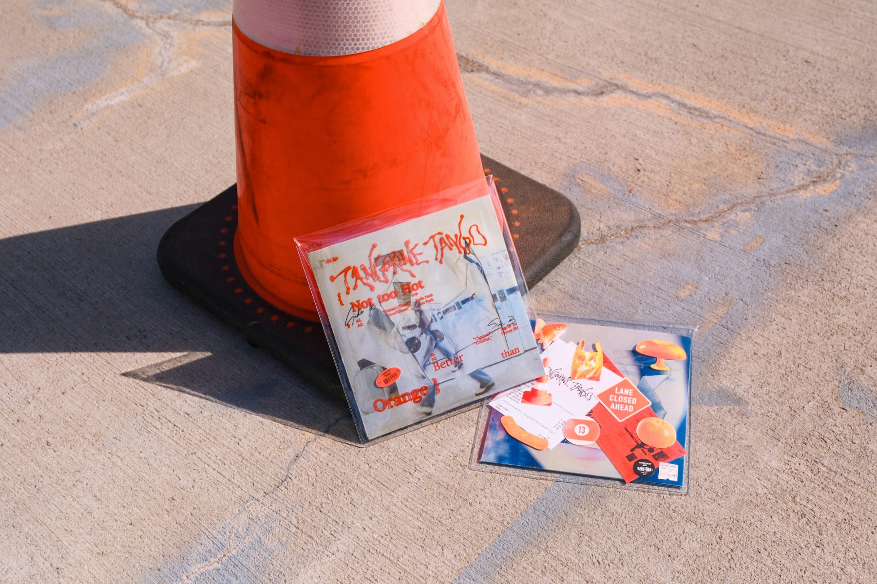
Not Too Hot, Better Than Orange

  • #Print
  • #Identity
  • #Packaging

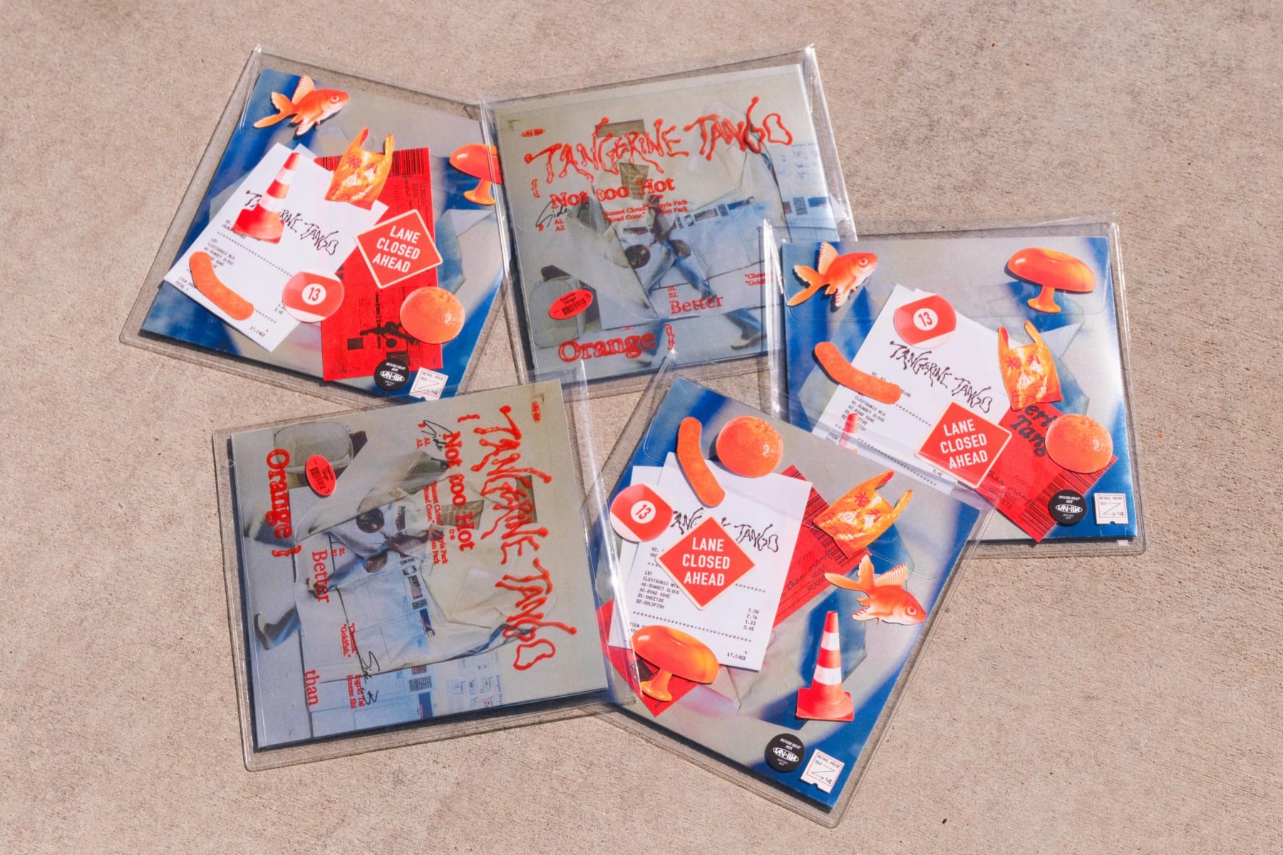
Not Too Hot, But Better Than Orange is the debut album of electronic music group Tangerine Tango. The record’s packaging emphasizes materiality and layering, incorporating transparencies, stickers, and metallic paper to create a tactile and interactive experience. Drawing from analog imagery, the design blends gritty textures with bold typography, using a mix of printed ephemera—such as receipts and tickets—to evoke a sense of nostalgia and everyday urban culture.

team members: Jiating Shi, Jayla Park, Sen Park, Ingrid Tai

Not Too Hot, Better Than Orange

2025 CalArts Expo

  • #Motion
  • #Identity
  • #Illustration

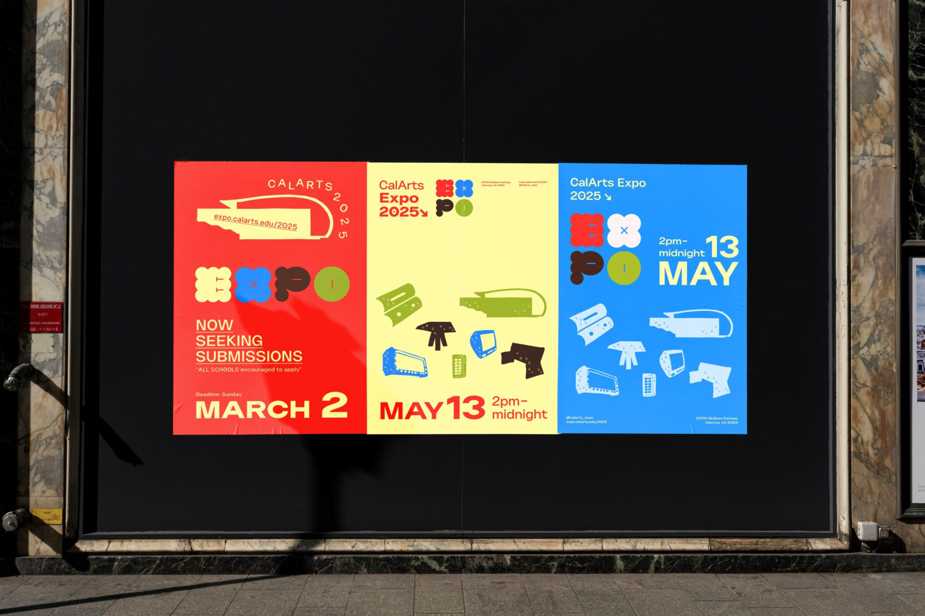
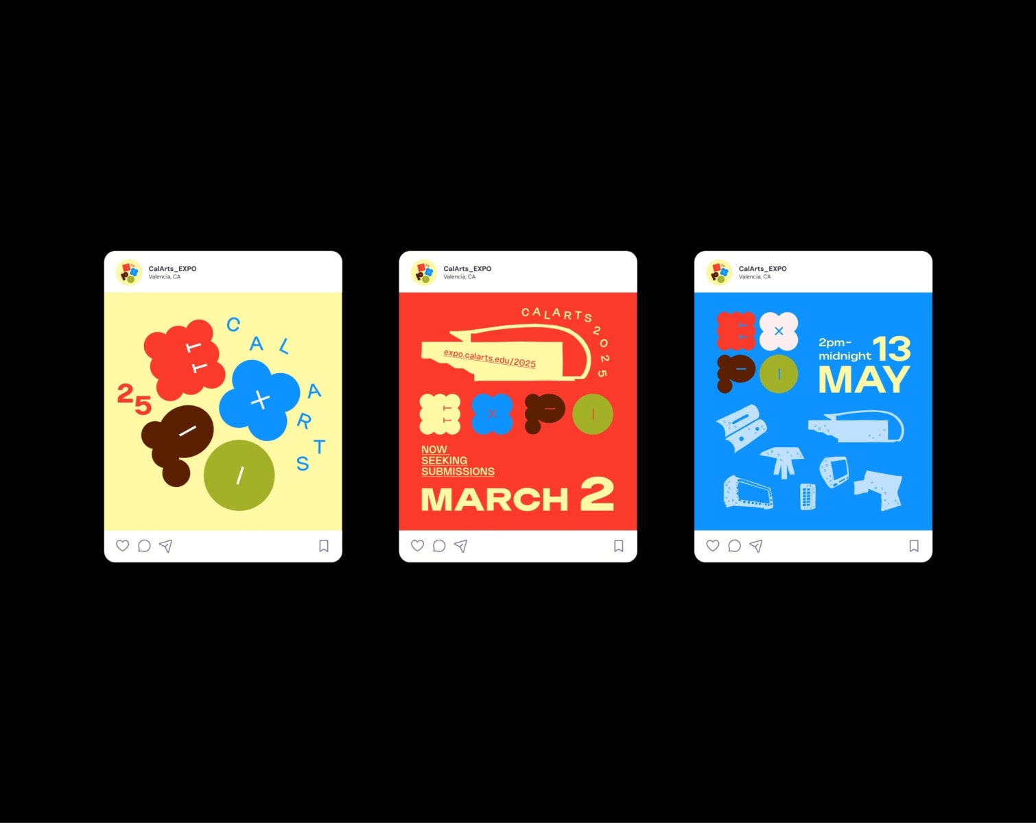
2025 CalArts Expo Identity design. Co-Designer: Ingrid Tai.
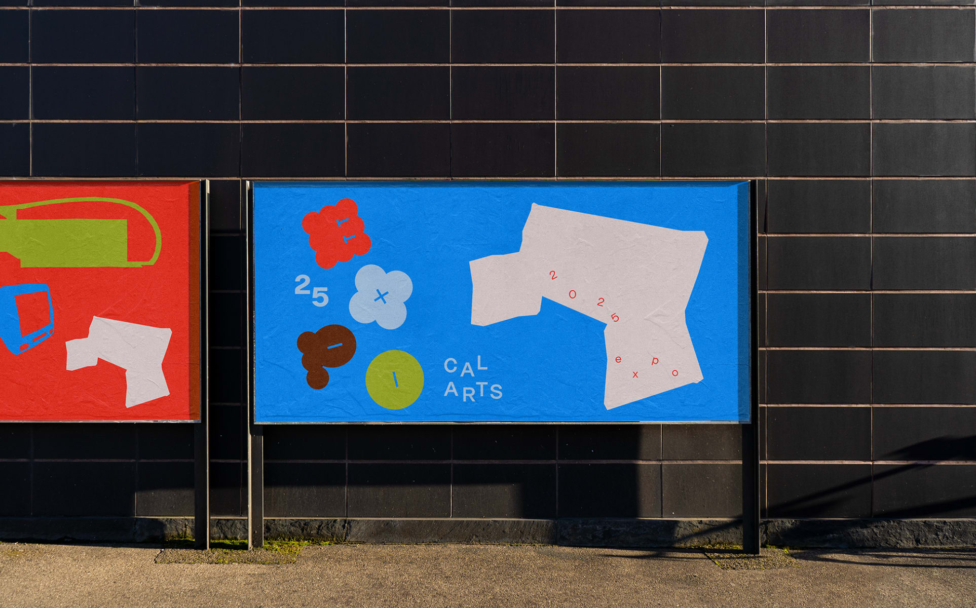
2025 CalArts Expo
2025 CalArts Expo
2025 CalArts Expo
2025 CalArts Expo